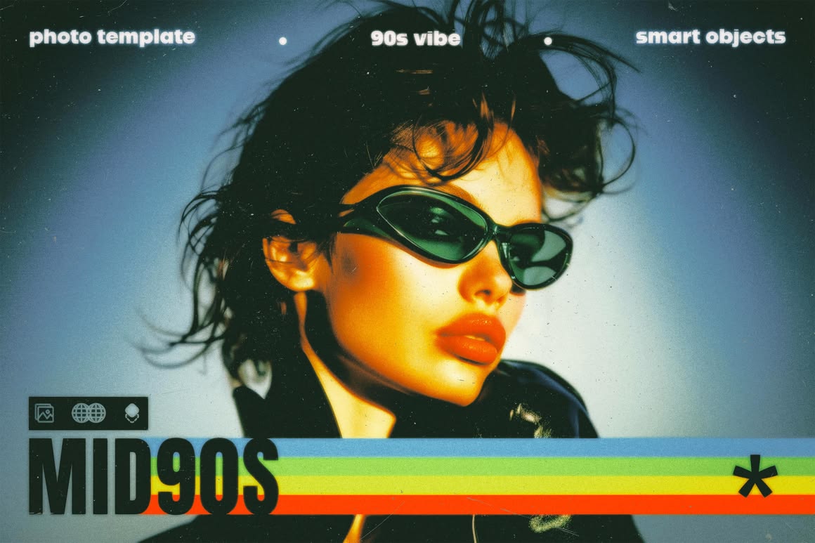
Scroll enough in 2026 and you will spot chrome gradients, chunky pixel accents, sticky-note yellows, dial-up-era iconography, and type that nods to early personal sites. Y2K and 1990s aesthetics are not a joke trend anymore — they are a deliberate reaction to years of sterile, interchangeable UI.
Nostalgia works because it feels human and specific. For businesses, the opportunity is selective borrowing, not a full Geocities reboot that breaks usability and trust.
Why Nostalgia Is Resonating Now
Many buyers grew up online in the late 1990s and early 2000s. Those visual codes trigger familiarity and play. At the same time, AI-perfect interfaces feel emotionally flat. Retro cues — metallic sheens, stamp textures, star bursts, lo-fi video overlays — signal personality in a marketplace of sameness.
There is also cultural fatigue with corporate minimalism. When every competitor uses the same soft shadows and stock smiles, a carefully chosen retro signal can make a brand feel alive again.
What Retro Done Right Looks Like
- Modern information architecture with nostalgic surface details.
- One era reference (Y2K chrome or 1990s print), not a costume party of every decade.
- Accessible contrast and readable body text — nostalgia never excuses illegibility.
- Fast performance: decorative GIFs and heavy textures stay optional and optimized.
The best retro sites still pass the five-second clarity test. Visitors should know what you sell before they finish admiring the chrome.
When Businesses Should (and Should Not) Use It
Creative studios, fashion, music, youth brands, cafes, and lifestyle products can lean harder into retro. Regulated industries, enterprise B2B, and medical services should keep nostalgia as a light accent or skip it. Trust still beats irony when money or health is on the line.
If you serve mixed audiences, confine retro to campaign pages or social creatives while keeping core conversion pages calmer.
How to Pilot a Retro Refresh
Start with a campaign landing page or a product drop, not a full domain redesign. Test engagement and enquiry quality. Keep checkout and contact forms calm and contemporary. Document the visual rules so your social content matches the site without becoming chaotic.
People are hungry for surfaces that look decided by human taste, not a default theme. Style without offer clarity is cosplay.
Pair retro visuals with contemporary UX patterns: sticky CTAs, clear forms, and fast enquiry flows. Let nostalgia live in art direction, not in broken navigation.
If you serve mixed audiences, confine retro to campaign pages while keeping core conversion pages calmer so you can test energy without gambling the whole brand.
Practical Takeaway
Retro is a flavor, not a strategy. Use it to create recognition and warmth, then back it with clear offers and modern UX. At Azryno we treat nostalgia as seasoning: enough to taste, never enough to overwhelm the meal — or the conversion path.