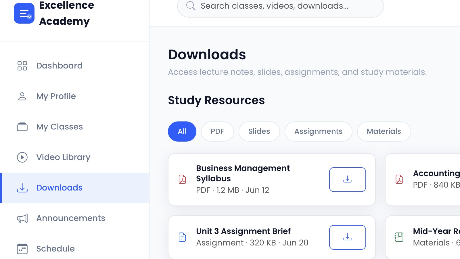
A parent researching a tuition centre is usually doing it in a hurry, often after a conversation with another parent. They want facts: which subjects, which grades, which teacher, which days, and how much. A website that makes them hunt for those answers feels like a preview of how the centre will communicate for the next year.
Clarity beats cleverness
Education sites are often overloaded with slogans about excellence and future leaders. Parents skim past that and look for the timetable. The most effective sites put course listings, fees and teacher credentials in plain view, then support them with a short explanation of the teaching approach.
This is also a sector where trust is local. Parents ask neighbours and check who else attends. The website should reinforce what they have already heard, not contradict it with vague promises.
What the site needs to include
- Course or class listings by subject, grade and exam level.
- Fees per term or month, plus any registration or materials charges.
- Teacher profiles with qualifications and experience.
- Class schedules and locations, including any online options.
- A simple enrolment or inquiry form, and a phone number.
- Past results or achievements, presented honestly and with context.
Results need care. A claim that "90% of students achieved A grades" means little without knowing the cohort size and subject. Honest, specific numbers build more credibility than round, impressive ones.
Reducing friction for parents
Enrolment often involves a phone call, a visit and a payment. The website can prepare for that by explaining the process in three steps and listing what to bring. A downloadable prospectus is helpful, but it should not replace readable page content.
For institutes with multiple branches, each location needs its own clear page with address, timetable and contact number. A single generic contact form for five branches creates confusion.
A trial class or open day is a low-pressure next step and should be easy to find. Even a simple "book a free trial" form gives a hesitant parent a way to test the teaching before committing to a term.
Content that helps beyond enrolment
A small resource section, such as exam preparation tips or a guide to choosing subjects, can bring in parents earlier and demonstrate teaching quality. It also gives the institute something to share during enrolment season.
Education providers that work with agencies like Azryno often find that a clear, text-first site with a straightforward admin panel serves them better than a heavily animated one, because timetables and fees change every term and need to be updated by staff.
Azryno education website projects
If parents have to call to find out the fee, the site is adding work rather than reducing it. Put the answers on the page.
Need help with this? Azryno is a web design agency based in Colombo, Sri Lanka. We build websites, brand identities, and graphic design that work for real businesses. Get in touch at https://www.azryno.com to get started.
Banner image: Azryno portfolio project.